Projects
Lansing Maple Syrup Festival
Poster, website layout, iTouch app, flyers, and stickers developed in Visual Communications II to promote the lansing maple syrup festival.
Contact
Email
Skype
Facebook
Phone
Résumé
The Lansing Maple Syrup Festival is an annual event that aims to educate and entertain its attendees by demonstrating traditional methods of maple syrup collection over the course of two days, Friday and Saturday. I was tasked in my Intermediate Visual Communication class with developing a poster, website layout, stickers, and app that could be used to promote the festival to my target audience of 25-35 year old professionals.
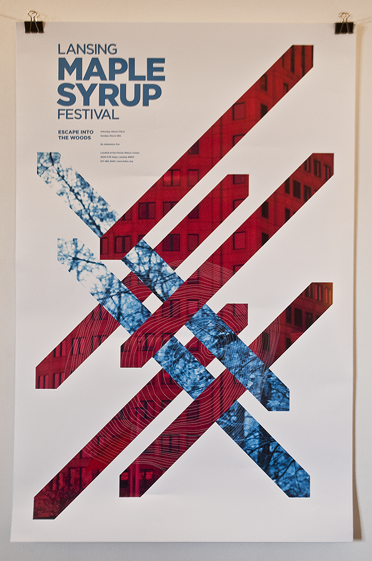
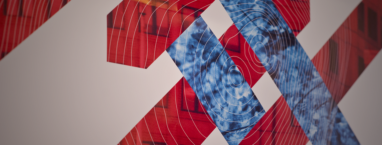
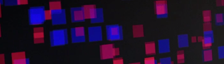
Above: The Lansing Maple Syrup Festival poster. It measures 18x36 inches. The tagline reads "Escape Into The Woods" and the copy next to it states date, time, and location of the event.
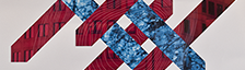
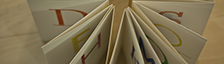
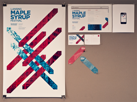
Left: All of the elements of this project: Poster, flyer, website, app, and stickers.
When developing the visual language that would be used to create my products, I spent a lot of time researching and thinking about what might want to make someone even learn about maple syrup production.
The best course of action seemed to be playing off the emotions that drive the will of my demographic to camp, hike, and generally experience the wilderness;
the want to escape office life for something more organic and alive.
You'll notice in my poster the use of duotones over a cityscape and tree canopy, clipped into diagonal bands. These represent the week of the festival; the 5 days spent in the city, living and working are highlighted in red to indicate action, destruction, and stress. The blue bands strike through and break up the red bands, representing the festivals aura of peace, restoration, and naturalness. The entire composition is tied together by tree rings that represent time and the cyclical nature of the festival's annual occurrence. The rings were created by referencing an actual maple tree section.
The other elements were all made to fit and reinforce the visual style of the poster. One of my favorite elements was the stickers. They were cut to be shaped like the diagonal bands and were semi-transparent, making whatever object they were stuck on match the color of the band they represented.
Designed and coded by Alex Bergin, 2012
All images, videos, and animations on this site, unless otherwise noted, are licensed under Creative Commons to Alex Bergin and may not be used for commercial purposes without permission.